The simplest strategy – be human

October 18th, 2010 § 1 comment § permalink

I got to chatting with Chris, one of the lovely Red Rock Coffee people, just now. In the course of conversation, I asked him if they collected more tips on a busy day. His answer was something I didn’t expect. He said no. He then said that they get tipped more on pay day, and then the other major factor in amount of tips collected depended on who manned the till and how they interacted with customers. I thought about my own tipping habits generally, and I realised that I do the same thing. I am more likely to tip when I’ve had a positive experience at the point of sale. Chris said that he does the same as a customer.

He started telling me about how he treats his customers. A smile, an effort to remember their names, asking them about how their day has been…. Small things, but lemme tell ya, it’s a skill, and Chris is great at what he does. I always enjoy chatting with him, and he always has a warm smile for me. Sometimes, his is the only conversation I get in a day, and that counts for a whole lot.

As he was telling me his secrets, I realised I do the same in my online profession, and commented that he does what I do – build a community. We both came to the agreement that ultimately community is what it’s all about.

And that’s the thing – whether you’re running an online or offline business, the one common factor that determines if your customer returns to you is how they felt at the point of contact. Make that a pleasant experience, and the customer becomes part of your community. And, importantly, you of theirs.

I’m often asked ‘How do I form a community around my business’? After listening to Chris and thinking about what I do, I think I’ve finally reduced it to the simplest answer possible – be human.
It’s not rocket science, but don’t be fooled. It is VERY hard work. Being human at scale is a skill. If you come across such a person, do whatever you can to make them part of your organisation. Someone like Chris might just be the best investment you could make for your online or offline business.
Keep in touch with the real world

October 7th, 2010 § 0 comments § permalink

The thing about being ‘tech savvy’, whether as a builder or a heavy user, is that we can get very caught up in how WE use stuff. Which can lead to a very myopic view of product and product design, to state the bleeding obvious.

The good news is that computer/web users are all around us. It’s super simple to keep in touch with how the average person uses virtual stuff. And since I’ve been doing a lot of it lately, I thought I’d share my simple research skillz with ya.

  • Stalk your close ones. Always keep an eye on how your family, friends, people you live with navigate sites. You’ll be amazed at how differently they do a Google search or get to a YouTube clip compared to… well, you. Example: I NEVER go to Google.com as a starting point…. people around me on the other hand….
  • If you’re anything like me, you might not have access to as many ungeekified people as you’d like. This is where stealth stalking comes in handy. Hang out at cafes, libraries, airports, anywhere you might encounter a bunch of people tap, tap, tapping away. You can glean a lot by glancing at your neighbour’s screen every now and then. (Not too much – the point isn’t to freak them out)
  • Pay attention to how customer service people behave with their machines. See, gives you something productive to do while in line, instead of resorting to queue-angst tweeting. 😛

There’s a wealth of information out there, and all you need to do is observe. Umm… and then apply obviously. I guarantee you’ll be more aware of the fact that your experience of the web is markedly different from most others’. At the very least, it’ll provide different perspectives. At the best, what you’ve seen will haunt you when you next draw up a user-flow chart or wireframe.

Saying NO to your customers

October 5th, 2010 § 4 comments § permalink

A friend brought my attention to this article this morning – Frito-Lay Trashes SunChips Bag After Biodegradable Packaging Criticized For Being Too Noisy. Quick summary – Company brings out new biodegradable packaging, customers think it’s too noisy and start making noise on social networks, company caves and reverts to old-bad-for-the-environment packaging.

Now, I’m a big proponent of listening to your community and feeding its responses back into product development. But here’s the catch. This process only works when you, the company or product manager, are willing and ready to say “NO”. Which is what I think Frito-Lay should’ve done in this case. I’ve thought about it, and it’s what my response to the outcry would have been.

I should explain myself. Listening to your community is a great way to get insight into how they use your product, what they want from it, what would make the product ‘something-they-use’ to ‘something-they-can’t-imagine-life-without’. It’s a way to be there for and give back to them and have them come back to you.

That’s what I see as an organisation’s responsibility to their community. But it also has a responsibility to its product (and by extension its stakeholders).
First thing to recognise about community feedback is that it isn’t necessarily the majority viewpoint. In my experience, a majority viewpoint usually consists of the majority of ‘noisy’ members in a community. (Note: I use ‘noisy’ as a term of endearment.)
Second thing to recognise about community feedback is that it can be wrong. It can be wrong for the product, it can be wrong for the company’s strategy, it can be wrong for the greater good.

And so it’s okay to say no to your community. “No” doesn’t have to be a confrontation. Do your research, get a handle on how big an issue it is for what percentage of your customers. Use that when you explain your decision and how you came to it. State in no uncertain terms why one path is better than the other. (In this case, Frito-Lay have a trump card – “We’re saving the planet!!” Tell me that won’t guilt the most noise-sensitive person into agreement ;P) Suggest alternatives to make a transition smoother. (Use a bowl for your chips?)
Above all, be human. Allow your community to connect with you on that level.

The Brewery: Universal @s

September 29th, 2010 § 2 comments § permalink

Scenario: I upload an image to Flickr and want to link a friend to it.
Problem: She exists on Facebook, not Flickr. There’s a chance she’ll see the image on FB and click through and see what I’ve said, but short of me dropping her a link directly, there’s no way for me to ensure that.

In my utopian web world, I could be on any site and tag anyone who exists on a completely unrelated service. Those who have tweets feeding into Buzz and Facebook will know that tagging someone on Twitter means @username will be linked on Buzz, but not Facebook.

Now, I know this isn’t an easy problem to solve. There are issues around consolidating identity, privacy and permission, dataportability, standards, scale…
One of the ideas swirling in my head is to have a repository of some sort. The repository handles the identity part of the equation. So I can go in there and tell it that ‘dekrazee1‘ and ‘Rai Pratibha‘ and ‘Pratibha Rai‘ are the same people. Maybe even allow it access to my social graph so it knows that if a contact is talking about a Rai, it’s me, not the other Rai. When someone tweets @dekrazee1, before the tweet is pushed to Facebook, the repository can tell it that the tag must be changed to Rai Pratibha to put it in the FB context.
Then all other services plug into it and voila! Universal people tagging! No more linearly restricted web! yaaay!
(Yes, I did say it was utopian… :P)

I’ve only spent a couple of hours thinking about this tonight, so haven’t done much research into it. Is anyone else working on something like this? Is it a solvable issue?

Pro Bono: My Flickr experience

September 22nd, 2010 § 0 comments § permalink

I’ve been a Flickr user since 2007, and in that time, I have uploaded about 4000 photos. I upload my images to Flickr for two big reasons – As a backup to my many backups, in case the unthinkable happens, but mainly as a way to share my experiences with my people.

The more I use Flickr though, the more limited I think it is. From Flickr’s About page, they list two goals – Sharing and Organising.

Let’s start with sharing. What I think works well on Flickr is uploading photos and distributing it to all my different channels. So anything I put up is sent to Facebook, Twitter (via Friendfeed), Google Buzz and my blog. (Well, that’s broken right now, due to the move to wordpress.org, but you get the point.) People from all my different networks are able to catch up with my uploads if they so choose. This is the main reason I don’t put my photos on Facebook. They would be constrained to just that network.

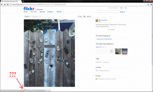
Once it gets to this point however, I feel that the continuing process becomes too restricted. A non-Flickr member who clicks through to my photostream can only view the image, check out Exif data and click through to other items in my photostream. If they want to make a comment, they’d have to sign up to the service. I can understand not allowing anonymous comments, as a Flickr user I wouldn’t want that, but asking someone to sign up to the WHOLE service just to leave a comment is a bit much isn’t it?
Why not add a blog-like comment form where non-members could leave identifiable comments on an image using a name and e-mail address, or using a 3rd party log in like Twitter or Google? My instinct is that some of my friends would be more amenable to sign up to Flickr once they’ve had some engaging interaction with it.

On to organising. The more I use Flickr, the more painful organising gets. I’m not sure if it’s because of volume, or that it took me a while to figure sets, collections and tagging out, but I keep finding myself wishing for a better deal. First off, I really really need a level higher than Collections. I find that I have a few Collections I’d like to link up, and there’s just no way of doing that.
Flickr lets you locate your photos on a map. Anyone who has used that probably know *just how painful* the process is. I guess it works better if your camera has geotagging, and maybe that’s what that feature is for specifically. Otherwise, it’s just too hard.
And finally, editing tags. Ever mistakenly added a tag to a set of images which is inaccurate, and tried to take the tag away? If there is a way to do that en masse, I haven’t found it. One has to go through each picture, page by page, click on the little ‘x’ and then confirm the deletion. Not fun.

And now for the big one – viewing images. Flickr recently had a major release where they tweaked their UI, made the default image size bigger and added ‘lightbox’ browsing. I really like browsing images in lightbox view, without the clutter of the single image pages. However, the image description is missing from the lightbox view, and is hidden on the single page view if the image is in a horizontal orientation.

I find that this really takes away from the browsing experience. People are telling a story through their pictures. Titles and descriptions are part of the story-telling. Not making these visible as we browse photos definitely takes away from the overall experience. The main experience on Flickr in my opinion…

How do you describe Twitter?

September 13th, 2010 § 1 comment § permalink

I found myself in a situation where I needed to describe Twitter to a friend yesterday. She is what I classify as a regular internet user – knows about and uses the ‘big’ sites – Facebook, YouTube, Google & Gmail (but has no knowledge of all their other services).

I tried explaining how it works – you send an sms, and it is broadcast, and others can read and respond to it – but the look on her face was telling me I wasn’t doing a very good job.

I eventually said “It’s like IM for status updates”. That seemed to get the idea across, but I don’t think it describes the service very well.

I can’t believe I don’t know how to explain Twitter despite using the service for something like 3 years now…. but then, it’s one of those things that needs to be experienced to be understood isn’t it?

Help me out please – how do you explain Twitter to someone new to it?

How to make location-based services less underwhelming

August 26th, 2010 § 2 comments § permalink

There’s been an explosion of location-based services lately, with even Facebook hopping in on the action, and frankly, I’m underwhelmed.
Before I go on though, I should make something clear. I don’t have one of them fancy new-age phones – I use a Nokia 6500-s. I have data on it, but no apps, so my opinion of location-based services is coloured by using their WAP sites.

Most of these services are focused on broadcasting where you are, listening in on friends’ broadcasts and simple gaming (check in, collect a badge, trade virtual goods etc). I feel that this gets boring really quickly. After the initial rush of unlocking badges and becoming the mayor of places on Foursquare, I became completely apathetic towards it. Getting a badge these days makes me go ‘Meh…’ and the only mayorship I really want is that of Red Rock Coffee or of a friend’s house. (cos let’s face it, that’s hilarious. :P) Oh, and don’t even get me started on FB Places. I checked in there once and lost all motivation to click through again.

What I’d really like is more practical use out of these services. Some ideas:

Location-based recommendation (idea A):
When I check in somewhere, show me what’s available around me, not just which of my friends are around me. Would be very valuable when I’m travelling or in an unfamiliar area. The tools I use to do this right now are either crowd-sourcing via Twitter or browsing Google Maps.

Location-based recommendation (idea B):
Keep track of the types of places I check in to and recommend similar places when I change my location. For example, I check in a lot at cafés around Mountain View and Palo Alto. When I’m in San Francisco, give me café recommendations! My check ins are a valuable insight into my preferences and habits. Use it to keep me interested and informed.

Event planning functionality:
My location doesn’t only exist in the now. It has a past and a future. An event isn’t only about when it is. It is also about where it is. Merge these aspects and allow me to plan or schedule in my location-based service. This is what we have to do now – event discovery -> rsvp on a service like Eventbrite -> add to calendar -> get reminders via email -> check calendar/event site for address -> attend event -> check in. Why not bring parts of the whole process together? I’m thinking Plancast infused into Foursquare.

Discovery:
Slightly related to the first idea listed above. As far as I can tell, the only way to find new locations is to browse where your friends have been or to check out the newly-crowned mayors list. If I am in City A why not show me a list of places with the most check ins, with the most tips, with the highest mayorship turn over…. You’ve got all this information, why not lemme at it?!

Location-based irl social networking:
Facilitate irl connections between people who have checked in at the same location. Guess what? I’ve done this by simply searching for a location on Twitter. People tweet that they’re where I am, and sometimes I reach out with an @ reply, and we connect irl. Or allow businesses to connect with people who check-in regularly. This already happens irl (with attentive businesses) and via Twitter. Once again, this information is out there. Just make it easy for us to use it.

I have a few more ideas which need to be fleshed out more, so I’ll leave it at that. Also, most of these aspects could be monetised. I’m running out of time – it’s time to check out of Red Rock – so might leave that for another day.

Pro Bono: Keep your terminology consistent Facebook

August 24th, 2010 § 0 comments § permalink

Happened to land on a group’s page today and decided I wasn’t interested in their endless updates and I wanted out. After I finally found the path to ‘adios amigos’ (fyi – it’s a tiny link under the left side bar) and clicked on it, I got this:

Notice how it changes from ‘Leave Group’ at the start of the path to ‘Remove’ in order confirm that’s the action you want to complete. It made me pause. It made me stop and think “Hang on, I thought I was leaving the group. What am I removing??”

Once again, it’s small stuff. But it interrupts my flow. Don’t do it. Unless Facebook is doing it on purpose, to make me stop and think, maybe change my mind in the process…. Hmmmm…

So, Hot Tip: Keep your terminologies consistent throughout your app please.

Disclaimer: In case my bro sees this post and gets the wrong impression – the group used in the screenshot, Plato’s Cave, his venture which I totally and fully support, wasn’t the one I was leaving. That screenshot was taken purely for demonstrative purposes. 😉

Do sweat the small stuff

August 19th, 2010 § 1 comment § permalink

Some of the most common issues I come across on the web are the most annoying to me as a user yet hard to keep track of as a producer. These are what I refer to as the small stuff. The stuff that isn’t primary functionality, and easy to overlook in testing. The stuff that you as a regular visitor to your site might never encounter.

Example 1 – Dead ends:

I was trying to sign up to Anno Books, and I used a plus-address in the e-mail field. Of course, they had a ‘Verify your e-mail address’ step which I forgot to anticipate. (For the record – END THE SIGN UP VERIFICATION MADNESS!) They sent me the verification link, I clicked on it, and I arrived at this:

Few issues:

  • ‘Oops we seem to have a problem’ isn’t helpful. Was it my fault or yours? Do I need to do something to correct it, do I have to just wait for you to fix stuff? Web makers, please make your error messages as informative (and obvious to the eye) as possible.
  • This page is a DEAD END. What do I do now? Where do I go?? Think about it. Somehow I got to your page, was convinced to sign up, went through the sign up and verification process – and now I’m stuck. I invested time and effort, and this blank page is the difference between whether I ever come back and visit you or if I move on and never look back.

The fix: As much as possible, inform the user about what went wrong. If there’s something they can do to fix it, let em know. If it isn’t something they can action, give them a path out of the situation. A link to contact support, a link to check an FAQ, a link to your blog, where you put up downtime notices… something, anything!

Example 2 – WTF moments:

I added a secondary e-mail address to my Paypal account, and clicked on the verification link (in this case, verification = good) This is where that took me:

The issue:
My brain goes – EGADS!! What have I done?!?!?! – and alarm bells start ringing. It tells me I have activated my ACCOUNT, linked a credit card AND to proceed I have to link my bank details. Really, W T F?? I actually did think I did something to create a new account, which of course, was not what I was trying to do. And the call to action, the big yellow ‘Continue’ button would mean having to give more information I didn’t want to. My eyes didn’t even register the little ‘Go to my Account’ link on the bottom of the page.

The fix: Don’t FREAK ME OUT YO!! Make sure your links lead to the relevant pages. I’m sure that account created page works well for newly created accounts, but in this case, I should’ve been taken to a page that simply said ‘Email verified, Go to Account’.

The ‘high level’ fix:
The thing is, as producers, these things are easy to miss. When I first started at Tangler, I usually only found out about these when our members told us about it. That’s a great first step – listen to your people. If there’s a small issue, fix it, and this is key – add a test for it in your testing process. That ensures that any subsequent annoyances will be picked up.

The other thing I learnt to do as a product person was to take some time out and focus on the small stuff. I’d go into the system and sign up, change details, break things on purpose etc, just to see where an error led, if we could do anything to improve the landing page, or if indeed we had a dead end in a sequence. It became a fun past time, something I’d do between big releases to unwind. Doing this became key when we released TanglerLive. We all know it’s crazy times going live with a brand new product, and the small stuff is often forgotten amidst the madness. But that’s ok. No one expects you to get it right at first go. Just keep your eye on the small stuff as you go.

Best ‘Come back and visit us’ email ever – Hollrr

August 12th, 2010 § 0 comments § permalink

I found this waiting for me in my inbox this morning:

Seriously, how cute is that?! First it made me laugh, then I read it again and went Awwwwwww. And now I’m sharing it. Compare this to most ‘come back’ emails which I open and barely read past the subject line. This not only got my full attention, it compels me to go back to hollrr.com and use it again.

So yes hollrr, I guess your flirting did get you somewhere… see ya back at the web app! 😉